Rory Dowling, Head of Packaging at Dún Laoghaire design studio Clickworks, tells Irish Printer how they worked with leading prints specialists to help new drinks Vegified and Deep RiverRock Relax and Revive stand out from the crowd.
Today’s consumers are very well informed about the importance of good nutrition and a balanced diet, but hectic lifestyles and an absence of time make achieving these goals more difficult than it first appears. The wall of information about clean eating, celebrity diets, and often contradictory nutritional advice leaves many scratching their heads in confusion and frustration. Increasing vegetable and mineral intake from food and drink is very much desired by consumers, but where do they start? Could this be done without shredding your own kale and wrestling with avocados? What if better nutrition could be achieved in a simple convenient way, where someone else has gone to the trouble of balancing these requirements for us? Exciting new drinks ranges Vegified and Deep RiverRock Revive & Relax achieve just this, creating great tasting, affordable drinks with benefits.
Clickworks has recently added a brand and packaging division to build on its success in brand strategy, business design and digital communications. With a strong record in brand creation and development, we were tasked with the challenging and exciting job of designing a brand and packaging proposition for an exciting new fruit and vegetable juice drink Vegified, and also an innovative health and wellness sub-brand for popular water, Deep RiverRock to meet the demands of the market.
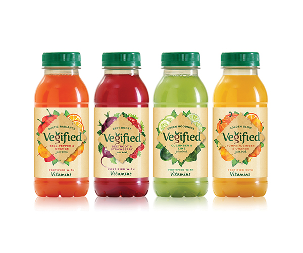
Vegified was specially created as a unique range of great tasting, affordable, vegetable and fruit drinks fortified with six essential vitamins. Many vegetable juices, while undeniably healthy, can be forbidding to consumers from a taste and texture perspective. Vegified is offering a light, fresh taste and vibrant natural colour. There are four delicious flavours, including Beetroot & Strawberry; Pumpkin, Ginger & Orange; Cucumber & Lime; and Bell Pepper & Orange. The flavour combinations work in perfect harmony. Each Vegified variant comes in at 60 or less calories per 300ml bottle.
The Brief
The design brief was to create a packaging design and visual language that encapsulates the goodness and great taste of these unique products in an accessible, colourful, impactful and differentiated way. Many competitors in the juice category have cutting edge designs with contemporary minimal cues. We felt that, given our rich, natural sources, our design should be warm, earthy and natural. Starting with the bottle, we created a simple silhouette with echoes of traditional artisan shapes. Its squat form and wide mouth are ideally portable, with the perfect portion sizes for a single serve drink. Our visuals were refined and technically realized by leading PET manufacturer Sidel.
We created label designs with a rich crafted quality that speaks of taste and naturalness. The Vegified logo at the heart of the design evokes the rich vegetable source of the juices. Our type with an organic, natural warmth was redrawn by hand to give a strong rustic effect and the lower case ‘g’ was reinterpreted as a vegetable with sprouting foliage and cascading root. The logo is contained within a striking rustic diamond of torn craft paper from which emerges a cornucopia of beautifully painted watercolour illustrations. Secondary typefaces and messaging are a beautifully balanced selection of crisp, contemporary fonts combined with warmer, spontaneous hand-drawn typography.
Print Techniques & Substrates
Having achieved our design and visual language, there still remained the not inconsiderable challenge of executing the designs with print techniques and substrates that would enhance and support the tactile simplicity of the designs. Leading Northern Irish print specialists Nuprint were appointed to work with us to achieve this. A key challenge was the choice of a suitable substrate. While as designers we very much wanted the label to be highly textured paper, this was not going to be compatible with the bottling process for the juices. Materials for the reel-fed process had to be waterproof plastic or they would tear or get wet during production. A 38micron BOPP was chosen and a matt varnish was used to give the natural paper the effect and tactility that we sought. The print process at Nuprint allowed for a very fine halftone, so we used a very subtle parchment texture which, when combined with the matt varnish, completed the totally convincing paper effect. Nuprint achieved a very fine, finished result with perfect colour balance, and the fine screens and excellent registration brought the design beautifully to life.
The early success of Vegified is evident. The new drink brand was honoured at the recent InnoBev Global Drinks Awards in Frankfurt, taking home gold for Best Juice Drink and Best New Brand against an impressive field of global competitors.
Today’s consumers continue to search for health and functional products to supplement their busy lives. There has been a 42% growth in the ‘health and functional’ segment in recent times and this trend shows no sign of abating. Bottled water is also showing continued growth as the importance of hydration chimes with consumers. Deep RiverRock, one of Ireland’s most iconic water brands, has been very successful in the last few years with a strong, graphic refresh and increasing consumer recognition of its strong brand equity and simple yet impactful visual language. The Deep RiverRock Revive & Relax (R&R) range has been specially created to meet the needs of today’s busy consumers who need help to achieve balance. Deep RiverRock’s ‘Revive’ range has two variants: magnesium to help reduce tiredness and zinc to help normal cognitive function. These unique combinations of still water and functional minerals will help consumers to keep going and stay ahead. Conversely, the ‘Relax’ variants of Lavender or Mint will help consumers to ‘stay in the mood’ or ‘simply relax’. And, as with all Deep RiverRock products, it starts with hydration, thanks to Deep RiverRock’s quality water sourced from the Glens of Antrim.
Creative Challenges, Complex Requirements
To design such innovative products presents a number of creative challenges. We needed to respect the Deep RiverRock brand equity with prominence for the iconic logo. We needed to clearly communicate that this is not regular water and give clarity to the enhancements and their functions. Functional products need a clinical purity, but this needs to be achieved in a way that is not cold or forbidding. Our ultimate designs have a simple purity that perfectly balances all these complex requirements.
The bottle format is the iconic Deep RiverRock silhouette which, in 500ml, has an elegant, ergonomic form with great portability due to the ripple style grippers on the side with the branding proudly placed above. Distinctive bottle colours, which are unique in the category, ensure maximum stand-out in in-store coolers. The vibrant red Revive bottles have cues of action, confidence and strength to match the benefits of the minerals. The rich purple Relax bottles have cues of life balancing, calm and soothing, to complement the natural botanical ingredients of lavender and mint.
The Deep RiverRock logo is placed alongside a striking medallion, which contains the R&R motif. Encircling rings contain Revive and Relax. On Revive SKUs the ring is red while Relax is recessive in silver and on Relax the ring is purple while Revive is muted. This medallion creates strong visual cohesion across the range. An elegant paneled grid structure contains the variant information in an elegant and accessible manner. The variant name is in a strong colour-coded bar. This is supplemented by a tab with a graphic icon representing the benefit. On the Revive SKUs, text outlines the benefits of each mineral. On the Relax SKUs, vivid representations of the botanical sources are vibrantly represented. There is also a strong balance of transparency, underlining the purity and simplicity of the Deep RiverRock brand.
Wraparound Labels Specialist
Venerable print house Americk Packaging in Enniskillen has nearly 30 years experience serving the international drinks industry and specialises in the production of reel fed OPP wraparound labels for the European soft drinks industry. Advances in HD flexography and technology in recent years have resulted in steep rises in quality and sharpness, making Americk’s process ideal for the production of the R&R labels. HD Flexo plates allow for a smoother lay down and finer aniloxes. This results in less ink and solvent use, leading to quicker runs, shorter drying and finer highlights. The flat top dot structure on the plates gives a stable and consistent dot structure, which is perfect for the finer detail we needed to achieve. We collaborated closely to achieve the best results. The printed labels are a testament to how far flexography has progressed in recent years and showcase the commitment to quality and precision championed by Americk.
The current market for enhanced or functional drinks is both challenging and exciting. To win in these categories, a fusion of great brand thinking and innovation is needed, combined with the highest standards of creativity and craft in both print and design. Both Vegified and Deep RiverRock R&R’s striking final designs showcase a perfect collaboration between brand owners, designers and printers. It is only by aligning all three that great results can be achieved.